RepCast
CMS messaging system redesign for healthcare sales.
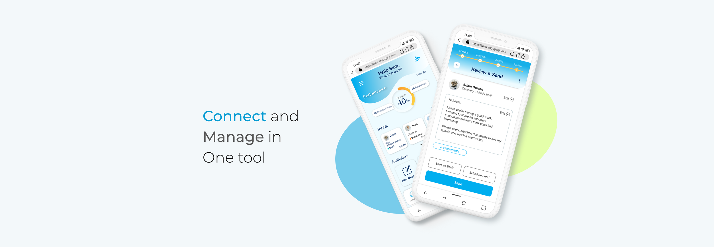
RepCast is a web app for healthcare sales reps to contact and share helpful information about new products with healthcare professionals (MDs, PAs, DOs, etc.) in a compliant manner.

SKILLS
UX Design
UI Design
TOOL
Figjam
Figma
Google Sheet
How might we build a hybrid system that sales representatives trust?
The goal of this project is to improve on our client's existing RepCast web app design in order to help healthcare sales representatives communicate with their clients more efficiently.
The challenge our client were facing was many sales reps are hesitant to try new systems because they think those can replace the communication part of jobs.
To address this issue, we plan to launch a new web app that gives the impression that it is assisting sales representatives in their work. As a result, we were able to cut messaging time by 45%. More information on how we provided solutions can be found below.


PROCESS
CHALLENGE
01 Understanding the product/situation
CMS tools differ according to the organization and purpose for which they are used. Because the product is for medical salespeople and we had very few sales experience or knowledge of the medical field, we spent half of the design process conducting product and user research through surveys and interviews.
We also created an SOW to go over and clarify the project overview, as well as our approach with a plan, in order to build trust with a client and avoid miscommunications. This aided us in working smoothly with the client and staying on track to complete the work.
02 Working as a Team
This project was a collaborative effort of three UX designers, and to complete the task in three weeks, we divided the task into the following roles, leveraging each other's strengths.
03 Limited information
Because the research period was only a week and a half, we were unable to find medical salespeople or people with medical sales experience in such a short period of time, so we broadened the scope of our research and enlisted the assistance of people with sales experience in a variety of fields. As a result, we broadened the scope of our research and enlisted the help of experienced salespeople from a variety of fields to gather insights for design solutions.
FIRST INTERACTION
We ran a first usability test to discover any improvements that may be made to the platform because our client already has the original demo of it.
The task given to the user was to create a new message and send it to the client.
Takeaways:
01 Users prefer to personalize their performance preview
02 Users prefer to access the video library immediately
03 Users prefer to arrange documents and message templates
SOLUTIONS
Based on the findings of the user study and the initial usability testing, we focused on the following areas:
01 Reduce the effort required to send tailored messages.
02 Build a hybrid system that sales representatives trust.
USER FLOW
We designed a new user flow to improve productivity and make it easier for users to create new messages.
SKETCHES
I began my design with a sketch that was based on the original demo as inspiration and added some new features to help users send messages to their clients efficiently.
Why Mobile? - Many salespeople prefer to use mobile devices these days, and this is because the majority of the work of a sales representative is communicating with clients, which can be done over the phone.
Why Web app? - Because the organization provides this CMS system and medical information must be kept secure, sales representatives must access it through their company's website.
Grayscale Wireframes:
RESEARCH
We conducted surveys and interviews with 13 former and current sales representatives to gain a better understanding of product users and identify pain points. Here are the key findings we discovered.

SECOND INTERACTION
We conducted another usability test of the new early-stage demo to identify the pain points and find solutions.
The task given to the user was to create a new message and send it to the client.
Takeaways:
01 Users choose to personalize their performance preview
02 Users prefer to access the video library immediately
03 Users prefer to arrange documents and message templates

DESIGN
Here are my design solutions reflect on the key findings.
HOMEPAGE
MESSAGE
PREVIEW
FINAL PROTOTYPE
Please feel free to try out the interactive prototype on the bottom!

REFLECTION
Challenge
Finding candidates for user research, specifically in healthcare sales, was difficult due to time constraints. To gain insights, we decided to conduct research on sales representatives from any genre. The research phase took longer than expected, but we were able to deliver the product on time because we communicated well and made a quick decision to overcome the roadblock we encountered.
Lessons Learned:
This was my first client project, and in order to improve communication with the client, we created a work statement that included a brief sprint of the redesign process and discussed it at the first meeting with stakeholders. This establishes the boundary between what we should focus on and what we can accomplish in the time available. I realized that it could be applied to any future projects to help me stay on track with my design process and teamwork.


